
7 Tips To Make Your Website Accessible
Web accessibility means that websites, tools, and technologies are designed and developed so that people with disabilities can use them. More specifically, people can:
- perceive, understand, navigate, and interact with the Web
- contribute to the Web
When developing or redesigning a website, evaluate accessibility early and throughout the development process to identify accessibility issues early, when it is easier to address them.
“Making the web accessible benefits individuals, businesses, and society. International web standards define what is needed for accessibility.”
— Web Accessibility Initiative, W3
What Do 508 Compliance and Accessibility Entail?
Legislation such as the Americans with Disabilities Act in the United States and the Disabilities Discrimination Act in the United Kingdom is fostering the development of assistive technology for persons with disabilities. Section 508 of the Rehabilitation Act in the United States is helping to make the World Wide Web more accessible as well. Do Section 508 Accessibility Standards Apply to My Website?
** Disclaimer: Please note that the following list of tips is not exhaustive and only includes some of the most common factors for creating accessible websites.
There are a number of ways in which you can make your site accessible for people with disabilities. These are some of the major features of 508 compliance:
1. Screen Reader Capability
Websites should be built with the ability to be accessed with a screen reader. Many people with disabilities use “Assistive Technology” to enable them to use computers and access the Internet. People who are Blind or Visually Impaired, as well as those with cognitive and/or learning disabilities, may use screen readers. A “screen reader” is the generic term for a program that helps people use a computer. Simply put, a screen reader will “read” (speak) aloud the content found on webpages.
It’s important to remember that screen readers process text differently than sighted users. For a more thorough explanation of how screen readers process content, view this helpful guide.
2. Accessibility with Keyboard
Computers in general, and web browsers specifically, can be operated with keyboard alone. People who are unable to use a mouse or see the screen, rely solely on their keyboard to navigate and access all website content. Your site should be fully navigable using a keyboard’s tab key, arrow keys, enter key, and spacebar. For example, links, buttons, or input fields can be controlled with the tab, arrow, or other keys rather than a mouse click to increase access for all.
Test to be sure all of your Web content is accessible. Using just the keyboard, try using the “Tab” key to navigate through the page. The “Tab” can be used to move between links to allow users to find specific content more efficiently. Be sure your website is coded so that users can navigate all content on a page via keyboard “tabbing”. You should be able to tell where you are at all times.
Common Keys Used in Keyboard Operation of Web Pages and Web-based Applications
- Tab – move to the next link, form element or button.
- Shift+Tab – move to the previous link, form element, or button.
- Enter – activate the current link or button.
- Space – check or uncheck a checkbox form element. Will also activate a button that currently has focus.
- Up/Down arrow keys – move between radio buttons or, in some cases, menu links.
- Right/Left arrow keys – in some cases, move between menu links or adjust sliders in audio and video plugins.
- Escape – Close the current modal dialog or dropdown menu and return focus to the element that spawned it.
3. Skip Navigation Links
Skip Navigation Links allow keyboard-only users to skip repetitive content like the mega navigation or main header and move directly to the main content on a desired section of the page. The inability to skip repetitive links can be a problem for those with mobility disabilities who use the keyboard to navigate instead of a mouse. Many sites have a lot of links at the top of the page. All these links before the main content mean that keyboard-only users and screen reader users must navigate through every single navigation link before ever arriving at the main content. This is not a great experience.
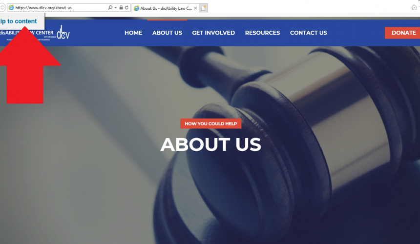
Skip navigation allows users to jump to key areas of content on a page. For more information on creating skip navigation and code examples, visit WebAIM’s “Skip Navigation” Links.
4. Alternative Image Text
Alternative text, or alt tecxt is primarily used by people who use screen readers to access websites, apps, and other software. Adding alternative text for images is the first principle of web accessibility. Alt text provides descriptive text to non-text content in web pages. All images need to have descriptive text attached to them for the visually impaired.
“On the surface, it is a simple concept to learn and is usually straightforward to implement.”
- Ensure that the alternative text is readable and descriptive for the user.
- Don’t include “image of,” “photo of,” etc.
- When a screen reader encounters an image, it will tell the user that it is an image. So, if your alt text included the phrase “image of,” the screen reader would say something like, “Image. Image of computer screen …”
- Keep it (relatively) short. ALT text is generally recommended to be concise (about 125 characters). The most popular screen readers cut off alt text at around 125 characters.
- If no ALT text is provided, then a screen reader would only be able to say “IMAGE” or perhaps provide a file name.
Let’s take a look at the example below.

Okay: alt=”pancakes”
This alt text is only okay because it’s not very descriptive. Yes, this is an image of a stack of pancakes, but there’s more to be said about this image.
Good: alt=”Stack of blueberry pancakes with powdered sugar”
This alt text is a better alternative because it is far more descriptive of what’s in the image. This isn’t just a “stack of pancakes” (as the first alt text example demonstrated); it’s a stack of blueberry pancakes with a dusting of powdered sugar!
Learn How to Create Alternative Text for Images for Accessibility and SEO.
5. Pop-ups
Do you have content, such as a survey, on your website that automatically opens in a pop-up window? If the answer is yes, it’s likely that your website will fail compliance testing. Pop-up windows present accessibility problems. Most usability experts would argue against the use of pop-up windows except in extreme cases.
More and more commercial websites are featuring pop-ups these days. In many instances, pop-ups are being used for advertising, rather to display supplemental content to the parent page. The failure comes when pop-ups appear unexpectedly. New windows take the focus away from what the user is reading or doing.
WCAG 2.1 bans all popup windows without explicit alert beforehand (On Focus 3.2.1 A).
6. Closed Captioning & Subtitles
If you have a video on your site, you must provide visual access to the audio information through in-sync captioning. For people who are Deaf or hard of hearing, closed captions or subtitles provide a real-time, on-screen text version of everything that is spoken in a video as well as any relevant sounds or inflections (such as music playing, off-screen cheers, sirens in the background, or sarcasm in tone of voice.)
Closed captions appear on the bottom (or top) of the screen as the video plays. This allows the viewer to read the text and absorb the visuals at the same time. Without closed captions, deaf or hard-of-hearing viewers would have to switch back and forth between watching a video and reading a transcript.
“In short, closed captions are necessary for your video to comply with the ADA and Section 508.”
Transcripts
A transcript is a text version of the media content. A transcript should capture all of the spoken audio, plus on-screen text and descriptions of key visual information that wouldn’t otherwise be accessible without seeing the video. Transcripts make video content accessible to everyone, including people who are unable to view the video due to accessibility problems or technical limitations. They are also helpful for people who want to quickly scan or search a video’s content but do not have the time to watch the entire video.
Transcripts are adequate to make audio content accessible to deaf or hard-of-hearing users, but videos need closed captions to be fully accessible to everyone. If you want to make your online videos accessible to people with disabilities, you’ll need more than just a video transcript. Closed captions along with an accompanying transcript are required to make a video accessible. The ADA requires that an equivalent alternative be provided for people with disabilities. Providing just a video transcript would fall short of effective accommodation.
This information is part of UW-IT Accessible Technology Services. Visit their webpage for helpful tips and resource links.
7. Choosing an Accessible Font
While there is no official ADA-enforced minimum size font for the web, it is recommended that you use at least 16px font for the body text. Of course, some text will be smaller, and headers will be larger, but for the main body text (like what you’re reading right now), it is usually 16px.*
*For the purpose of this section, we will be referring to font sizes in px (pixels) instead of pt (point) so it’s easily relatable to the framework of the web and digital space.
Which standard fonts are accessible?
One of the most accessible and most widely available fonts is Arial; others include Calibri, Century Gothic, Helvetica, Tahoma, and Verdana. All these fonts are “sans serif” fonts. A serif is a little decorative line that is found on letters in some fonts such as Times New Roman or Georgia. “Sans serif” means “without the decorative line.”
Fortunately, most browsers allow users to enlarge or shrink the font size on their screen according to their preferences. However, it is still considered best practice not to publish anything smaller than the equivalent of Arial 12 pt (replace this text with 16 px). Users with low vision often alter the settings of their browsers to accommodate their needs. Some users use screen enlargement software to accomplish this task. It is important that your design accommodate increased text sizes without loss of readability or functionality.
Tips on fonts and web accessibility
In terms of font accessibility, there are a number of principles to keep in mind to make your digital communications as accessible as possible:
- Select basic, simple, easily-readable “sans serif” fonts .
- Use a small number of fonts, ideally only 1 or 2 for headings and body text.
- Make sure there is good color contrast between the text and the background.
- A recommended minimum font size is 12 pt.
- Text is ranged left or left-aligned
- Use real text rather than text within graphics.
- Use bold to add emphasis rather than italics or UPPERCASE, but use it sparingly!
- Don’t animate text and avoid making the letters flash or blink.
Test the accessibility of a website
Here are some basic tests you can do evaluate the accessibility of a website.
Manual testing
Try to navigate a website using only a keyboard. Use a combination of the “Tab” and “Enter” keys.
- Are you able to access all links, menus, or interactive components such as accordion panels, pop-up navigation menus, or carousels?
- Are you able to pause an image carousel?
- Can you see where your cursor is located on the page?
- Does the cursor follow a logical path from top to bottom and from left to right?
Screen reader testing
Trying navigating a website using a screen reader with your monitor turned off. If you are using an Apple Mac, you can try the built-in screen reader utility called VoiceOver, found in the accessibility settings. If you are using Windows, you can download a free screen reader like NVDA.
Alternatively, another great tool for content editors and developers is ChromeVox. ChromeVox is a light weight Google Chrome extension that’s easy to install and learn, making it great for testing purposes. View ChromeVox Keyboard Shortcuts.
Automated testing
There are many free tools, plugins, bookmarks and applications available to test the accessibility of a website. Please note that automated tools should never be used to validate conformance with accessibility guidelines – only a human can determine true accessibility. Here are a few tools you can add to your testing toolkit.
- WAVE Web Accessibility Evaluation Tool – Highlights accessibility issues visually on your website.
- Tota11y by Khan Academy – An accessibility visualization bookmark.
- Accessibility Developer Tools for Google Chrome – A Chrome extension for developers to audit the accessibility of a website within the Developer Tools tab.
- Tenon.io – An accessibility tool for developers.